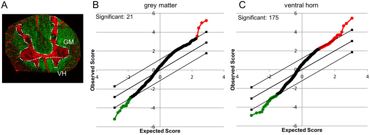
Figure 3. Statistical Analysis of Spectral Data using SAM.
Spectral data of previously outlined regions as revealed by image analysis were subjected to statistical analysis of microarray data (SAM). Spectra acquired in positive and negative mode for the GM- and VH-areas (A) were analyzed. (B, C) SAM plots illustrate relative changes of ALS versus control in the respective areas as revealed by unpaired t-statistics. The x-axis illustrates the degree of significance, while the y-axis refers to the observed degree of change. Red illustrates a relative increase in ALS compared to control, while green illustrates a relative decrease in ALS to control. The borders indicate the significance threshold (p < 0.05).

