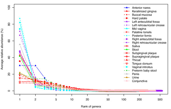
Figure 3.

Bacterial distribution patterns viewed by rank abundance curves. The genus distributions are illustrated by rank abundance curves. The x-axis represents the ranked genera from high to low. The y-axis shows the average relative abundance for a given genus. Twenty-two different line shapes and nine different colors represent the 22 habitats in this study. One or a few genera dominate each habitat with a long tail representing rare genera. This bacterial distribution pattern agrees with the species abundance pattern in other environments.
