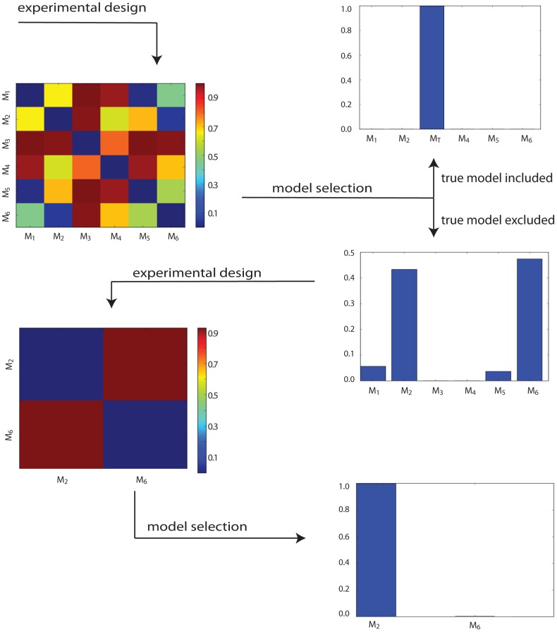
Figure 3. Flow diagram showing two rounds of experimental design and model selection.
The heat maps on the left show the Hellinger distances between the prior predictive distributions of model pairs, for the chosen experiments. Bar plots on the right give the posterior probabilities of each model with respect to data produced by the chosen experiment. After the first experiment, models  and
and  have the most support, but evidence to choose between them is negligible. However a second experiment designed for only these two models (with priors set according to the posterior probability proportions after the first round of model selection) strongly favours model
  .
.

