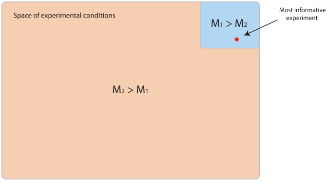
Figure 8. Model predictive power v.s. predicted confidence.
Model  explains data produced from experiments in the blue region better than model
  . The opposite is true for the larger orange region. In this example, the most informative experiment generates data that favours model
  . Performing model selection using such data will lead to the highest possible confidence we can generate for either model, and yet the chosen model will be the least predictive i.e.
  reflects reality better for the majority of considered experimental conditions. In this particular case, we have a greater chance of choosing the most predictive model by performing a random experiment.

