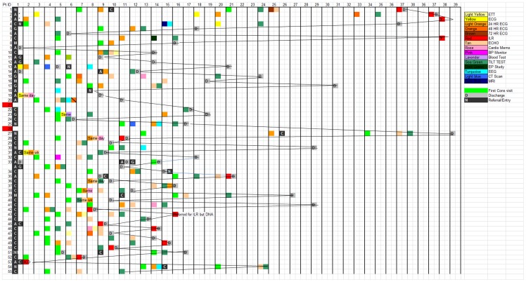
Figure 2. Example of summary chart of patients' journeys in a single hospital.
The horizontal axis represents time; patient entry is marked with the black box on the far right. Each coloured square is a visit or diagnostic test. A list of the possible diagnostic tests is shown in the legend on upper right. Shaded squares represent discharge. As can be seen, the sequence of each patient journey is different and the waiting times are long and vary greatly between patients.

