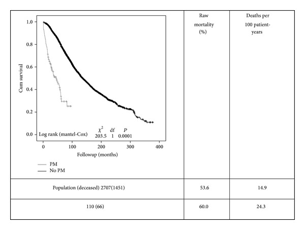
Figure 2.

Kaplan-Meier survival curves comparing both groups (PM-pacemaker grey line and non-PM black line). Curves are quite different and show a high mortality in both groups, particularly in the PM group. Mortality (raw and adjusted) rates are shown on the right side of the figure.
