Figure 3.

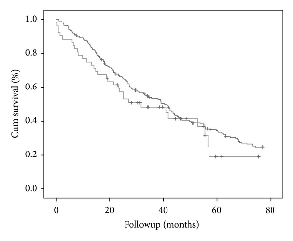
KM survival curve after propensity-matched adjustment. The darker grey line corresponds to the non-PM group and the lighter grey to PM group. There are no differences regarding survival between both groups (P = NS).

KM survival curve after propensity-matched adjustment. The darker grey line corresponds to the non-PM group and the lighter grey to PM group. There are no differences regarding survival between both groups (P = NS).