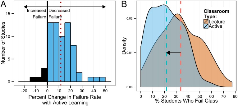
Fig. 1.
Changes in failure rate. (A) Data plotted as percent change in failure rate in the same course, under active learning versus lecturing. The mean change (12%) is indicated by the dashed vertical line. (B) Kernel density plots of failure rates under active learning and under lecturing. The mean failure rates under each classroom type (21.8% and 33.8%) are shown by dashed vertical lines.

