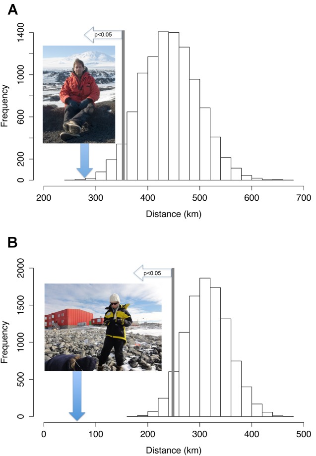
Figure 3. Graphical comparisons of bootstrapped data (histogram) and actual mean distances (image with blue arrow).
(A) Distance of ASPAs to tourist landings. Image credit: Aleks Terauds. (B) Distance of ASPAs to landings associated with national programs. Image credit: Dana Bergstrom. Histograms show frequency distribution of 10,000 by means of 55 locations sampled from 1,000 randomly generated, spatial, ice-free locations. Mean distances to ASPAs for both tourists and scientists are well outside the fifth percentile of the histogram (p<0.05), indicating that visitor landings are significantly closer to ASPAs than would be expected by chance.

