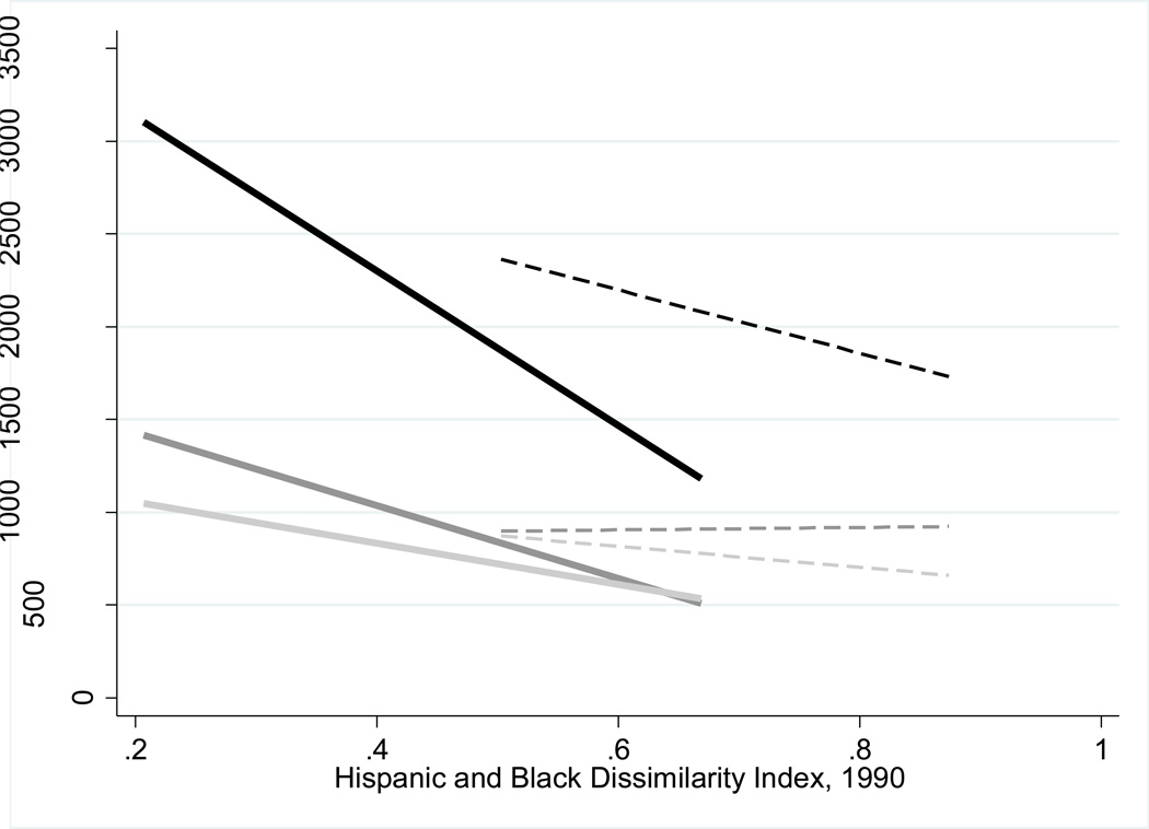
Figure 6.
Lines of best fit for the relationship between heroin price and segregation. Black lines indicate the average price per pure gram, 1990 to 1992. The dark grey lines indicate the average price per pure gram, 1993 to 2000. The light grey lines indicate the average price per pure gram, 2001 to 2008. Solid lines are Hispanic segregation and dashed lines are black segregation.

