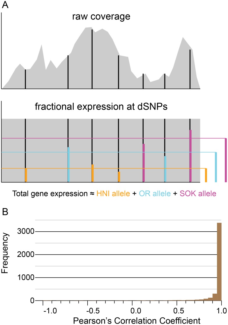
Figure 2. Illustration of ASE method and analysis of artificial data.
(A) Cartoon of the raw coverage observed when RNAseq reads are mapped to an example mRNA transcript and the effect of normalizing coverage across the transcript. In both raw and normalized coverage plots, black vertical lines indicate the positions of dSNPs. In the cartoon of normalized coverage, the colored vertical bars at dSNP positions indicate the contribution of the discernible allele to the overall expression, and the colored bars to the right indicate the average of expression values measured at dSNP sites for each allele. (B) Correlation of known ASE values to calculated ASE values for the synthetic data test. The calculated allele-specific expression values are compared with the original known values for each transcript by calculating a Pearson’s correlation coefficient. This will measure how well the trend in the calculated ASE values matches the trend in the original ASE values. Over 75% of the transcripts (2,628) had a correlation coefficient greater than 0.8.

