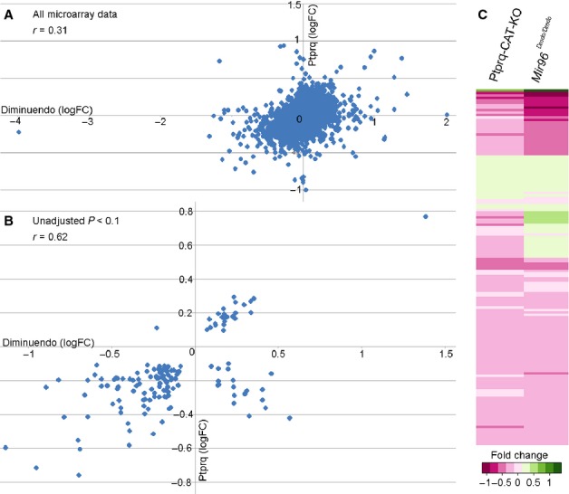
Fig. 8.

(A and B) Scattergraphs showing correlation of data from the two microarrays; A shows the correlation of all genes present in both microarrays regardless of significance while B shows the correlation of those genes with an unadjusted P < 0.1 in both microarrays. (C) Heatmap created using the R statistical software package, showing genes with an unadjusted P < 0.1 from the Ptprq-CAT-KO microarray (left) compared with the same genes (also with unadjusted P < 0.1) from the diminuendo microarray (right). Genes are compared and coloured according to their proportional change, on a scale from dark pink (most downregulated) to dark green (most upregulated).
