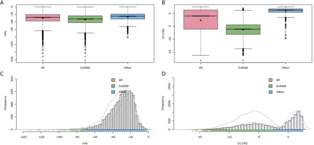
Figure 5.

(A) and (B) The boxplots illustrate the spread of the training 2 dataset for the MFE feature (left) and the SCORE feature (right). The y-axis shows the values of the feature, and the x-axis shows the class of data. (C) and (D) Histogram plots of the MFE and SCORE features.
