. 2014 Jun 24;3:e02020. doi: 10.7554/eLife.02020

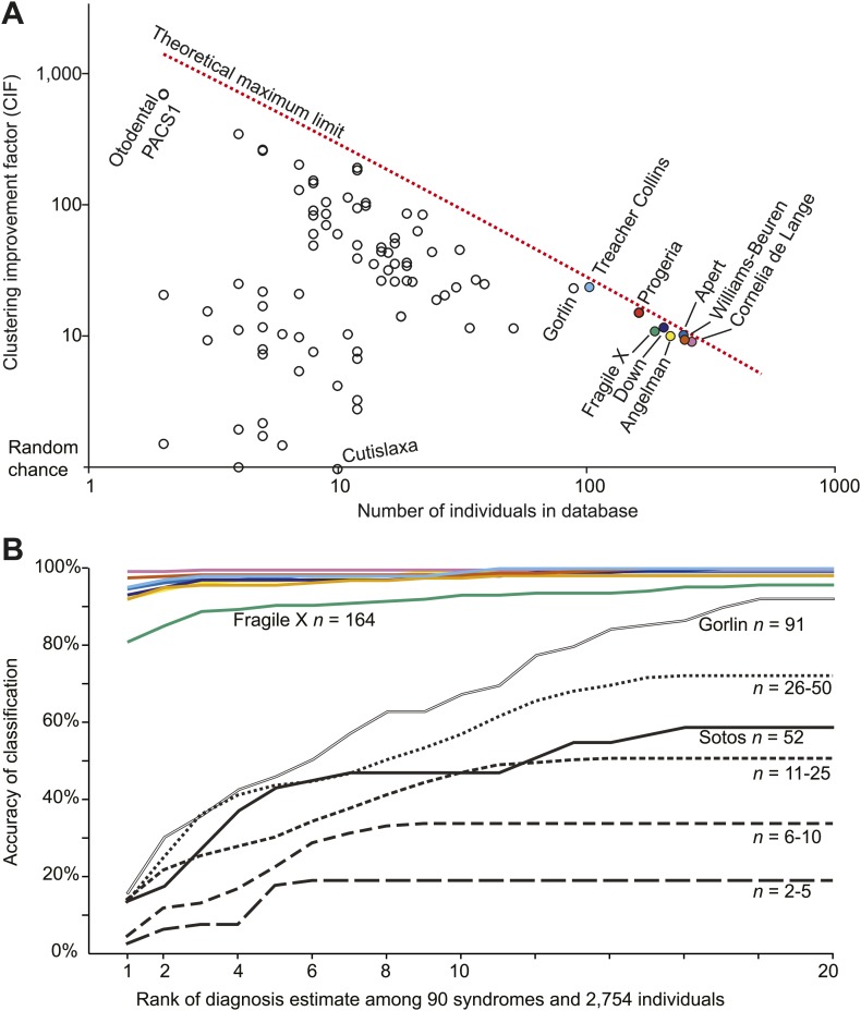
Figure 4. Clinical Face Phenotype Space is generalizable to dysmorphic syndromes that are absent from a training set.

(A) Clustering Improvement Factor (CIF) estimates are plotted vs the number of individuals per syndrome grouping in the Gorlin collection or patients with similar genetic variant diagnoses. As expected, the stochastic variance in CIF is inversely proportional to the number of individuals available for sampling. The median CIF across all groups is 27.6-fold over what is expected by clustering syndromes randomly. That is to say, the CIF of a randomly placed set is 1. The maximum CIF is fixed by the total number of images in the database and by the cardinality of a syndrome set: the theoretical maximal CIF upper bound is plotted as a red dotted line. The CIF for the minimum and maximum, Cutislaxa syndrome and Otodental syndrome, were 1.0 and 700.0 respectively. (B) Average probabilistic classification accuracies of each individual face placed in Clinical Face Phenotype Space (class prioritization by 20 nearest neighbors weighted by prevalence in the database). The 8 initial syndromes used to train Clinical Face Phenotype Space are shown in color. For syndromes with fewer than 50 examples, accuracies were averaged across all syndromes binned by data set size (i.e., the average accuracy is shown for syndromes with 2–5, 6–10, 11–25, and 26–50 images in the database, Supplementary file 1). Classification accuracies increase proportional to the number of individuals with the syndrome present in the database. Accuracies using support vector machines with binary and forced choice classifications are shown in Figure 4—figure supplement 1 and Figure 4—figure supplement 2. A simulation example of probabilistic querying of Clinical Face Phenotype Space is shown in Figure 4—figure supplement 3.

DOI:http://dx.doi.org/10.7554/eLife.02020.011

Figure 4.

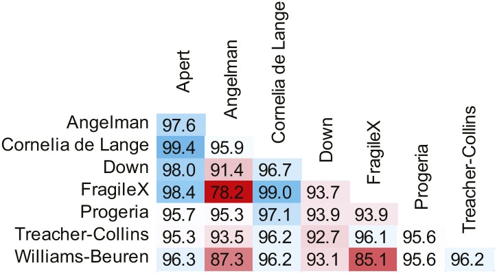
Figure 4—figure supplement 1. SVM binary classification accuracies among the 8 syndromes in Table 1.

Figure 4—figure supplement 1.

SVM classifier accuracies when tuned for equal false positive and false negative error rates.
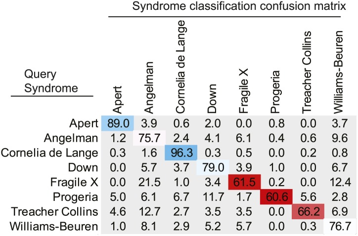
Figure 4—figure supplement 2. SVM forced choice classification accuracies among the 8 syndromes in Table 1.

Figure 4—figure supplement 2.

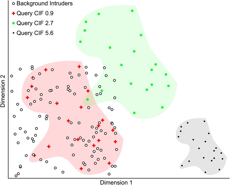
Figure 4—figure supplement 3. Simulated example illustrating the Clustering Improvement Factor.

Figure 4—figure supplement 3.

A random scattering of 100 points in 2 dimensions is used as a background set (black circles with white fill). The 20 red plus symbols (within the red shaded area) are a random set of points lying within the same limits as the background set and have a CIF of 0.9. This is the actual degree of clustering of the red points with respect to the expectation of clustering them with 95% confidence (E(r) = 5.6). The filled green circles (within the green shaded area) are the red points shifted by +0.5 units in each dimension and have a CIF of 2.7. The black points (within the gray shaded area) are the red plus symbol positions scaled by 0.5 and then shifted by +1.5 units in dimension 1. The black points are non-overlapping with the background and represent the maximal CIF (of 5.6) in this example.
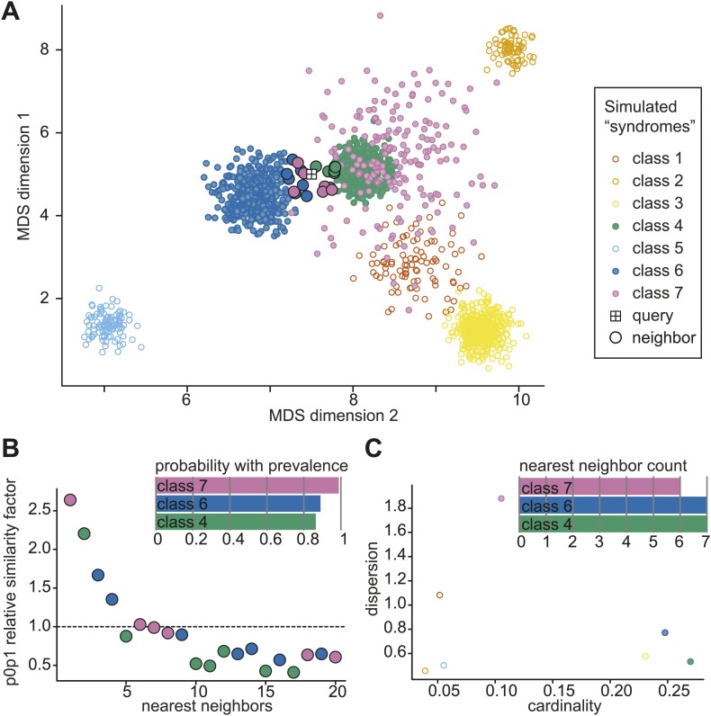
Figure 4—figure supplement 4. Simulated example of probabilistic querying of Clinical Face Phenotype Space.

Figure 4—figure supplement 4.

(A) Visualization of a population of simulated faces in the first two Multi-Dimensional Scaling (MDS) modes. 7 classes of points (simulated 'syndrome groups') are shown with different distributions and variances. A central 'query' face is indicated by the boxed cross. The 20 nearest neighbors of the query are encircled with a black border. (B) Inset bar graph shows diagnosis hypothesis ranked by class priority. The class priority ranking weights the dispersion and prevalence (spread and number) of a class in the Clinical Face Phenotype Space with the nearest neighbors to assign the most probable diagnosis hypotheses. In the example, the ranked diagnosis estimates of the query point would be class 7, then class 6, and thirdly class 4. The scatter plot shows the individual similarity p0p1 estimates, reflecting their relative closeness in the space as compared to local neighborhood, for the 20 nearest neighbors of the query. The first nearest neighbor is estimated to be 2.6-fold closer to the query than the average based on the local density of neighbors. The dotted line indicates the average relative distance between points among the 20 nearest neighbors. (C) Inset bar graph shows the number of neighbors of the query per class. A scatterplot of dispersion vs cardinality, i.e. relative spread of points and what proportion of the total number of points belong to that class in the simulated space. Plots (B) and (C) allow objective assessment of the distribution of points shown in (A), and aid the interpretation of classification confidence.