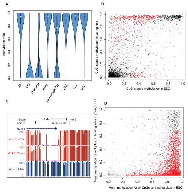
Figure 4. HSC specific methylome.
(A) Violin plot showing DNA methylation ratios in different genomic features. The thickness of the bars indicates densities of CpGs at the y-axis ratio; the white circle indicates median.
(B) Scatter plot for mean methylation ratio for all the CpGs of each CGI in HSC compared with ESC. The x-axis and y-axis indicate the methylation ratio of each CpG island in HSC and ESC respectively. The black dots represent loci that are not significantly different between the cell types, and the red stars represent the CpG Islands that exhibit cell type-specific methylation.
(C) Genome browser view showing the percentage of methylation in the promoter of the Runx1 gene in young and old HSCs and ES cells (ESC).
(D) Methylation ratios in HSCs versus ESC of Runx1 binding sites as mapped in mouse HPC7 hematopoietic progenitor cells. Black and red as denoted in (B)
See also Figure S4

