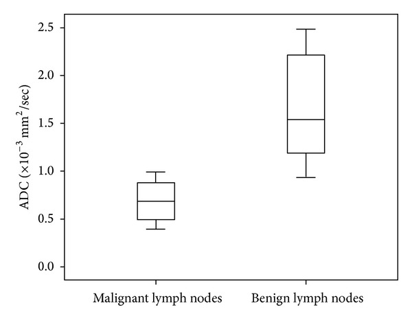
Figure 4.

Graph of box plots shows the apparent diffusion coefficient (ADC) values of malignant and benign lymph nodes. The horizontal line in the box represents the median (50th percentile), whereas the top and the bottom represent the 25th and 75th percentile, respectively. The whiskers represent the range from the largest to the smallest measured ADC data. The ADC values of benign lymph nodes are higher compared to those of malignant lymph nodes.
