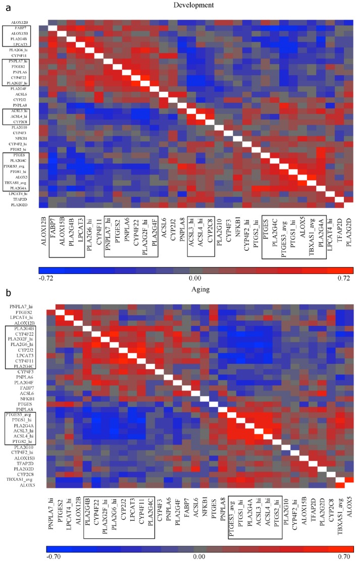
Figure 3. Similarity matrices showing correlations between genes in the Development (A) and Aging (B) intervals.
Calculations and figures were generated using Partek Genomics Suite (Version 6.6 2012). Red indicates positive correlation and blue negative correlation. Scale on the bottom shows the range of colors with values at the extreme of each color; the development interval (A) ranges from -0.72 (bright blue) to 0.72 (bright red) while the aging interval (B) ranges from −0.70 (bright blue) to 0.70 (bright red). The x- and y- axes are the same; thus the two halves of the matrix (split by the white boxes) are simply reflected versions of one another. Black boxes denote the groups of genes that are highly positively or negatively correlated with one another. Development: n = 87, Aging: n = 144.

