
Figure 4.
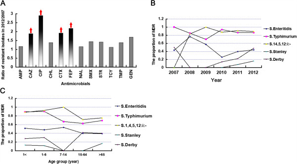
The ratio of resistant isolates in 2007 vs 2012 (A), and the association of MDR isolates within top 5 serovars with time (B) and age (C). The red arrows showed the dramatic upgoing of the proportion of resistant isolates among total isolates (A). In panel B and C, Each data point means the proportion of MDR isolates in the present year, different serovar are indicated using different symbols as illustrated in figure.