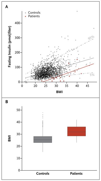
Figure 2. Assessment of Insulin Sensitivity and the Body-Mass Index (BMI) in the 15 Patients and 2097 Population-Based Controls.
Panel A shows the relationship between fasting insulin levels and BMI, with adjustment for age and sex. The 5th and 95th percentiles for the controls are shown as gray dashed lines; the regression slopes between fasting insulin and BMI are shown as solid lines. Panel B shows BMI data for the patients (mean, 32 [range, 23 to 42]) and for the controls (mean, 26 [range, 15 to 48]). In the box-and-whisker plot, the horizontal line inside the box represents the median, the top and bottom of the box represent the interquartile range, and the vertical bars (“whiskers”) represent the range; outliers are shown as individual data points.

