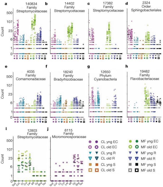
Figure 3. Dot plots of notable OTUs.
Counts for each OTU (number at top keyed to Supplementary Table 3) from the rarefied table were log2-transformed and the counts for each sample plotted as an individual symbol. The y axis is labelled with the actual (untransformed) counts. a–h, Each position on the x axis is labelled with a symbol to represent the sample group, and samples from that group are plotted in the column directly above. Biological replicates in the same column have different hues. The median of each replicate is shown with a horizontal black bar; some are invisible because they are at 0. i, j, Each x-axis position is labelled by Arabidopsis accession; samples from that accession are plotted above each label. Each OTU in the figure has model predictions in several categories (Supplementary Table 3).

