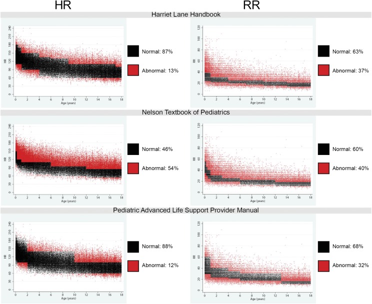
FIGURE 2.
Scatterplot array showing the distribution of HR and RR in the study sample compared with textbook reference ranges. Each point on the scatterplot represents 1 vital sign observation. For each reference range, observations that would be considered normal are colored black, and observations that would be considered abnormal are colored red. We found that 12% to 54% of HR observations and 32% to 40% of RR observations in our study sample deviated from the ranges provided.

