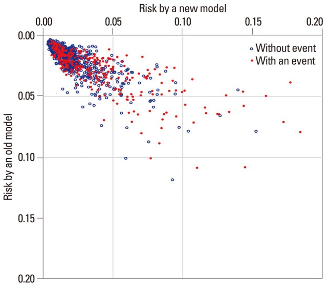
Fig. 3.

Simulated scatter plot comparing the performance of two prediction models. Vertical axis indicates the risk predicted by an old model. Horizontal axis indicates the risk predicted by a new model. The red dots are those with an event of interest, and the blue open circles are those without event.
