
Figure 2.
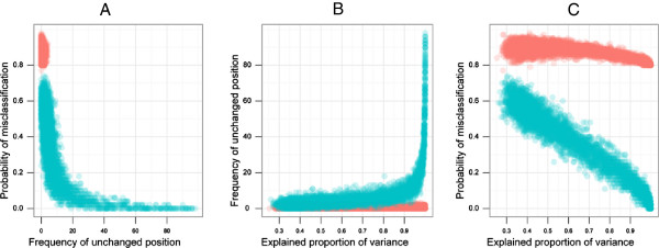
Scatter plots between frequency of unchanged position and probability of misclassification (A), proportion of explained variance and frequency of unchanged position (B) and proportion of explained variance and probability of misclassification (C). The data in red refer to those simulations where the probability of misclassification were consistently more than 80% irrespective of different levels of explained proportion of variance. The data in green refer to those instances where the probability of misclassification is negatively correlated with explained proportion of variance.