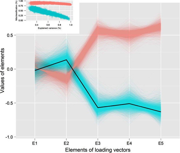
Figure 3.

Parallel coordinate plot of the elements of loading vectors. The green color corresponds to the cluster that indicates the increasing proportion of explained variance decreases the percentage of misclassification into quintiles. The dark line indicates the population loading vector based on which data were generated. Inset, the scatter plot of the proportion of explained variance and percentage of misclassification matching color with the parallel coordinate plot corresponds which estimate of loading vectors are linked with those clusters.
