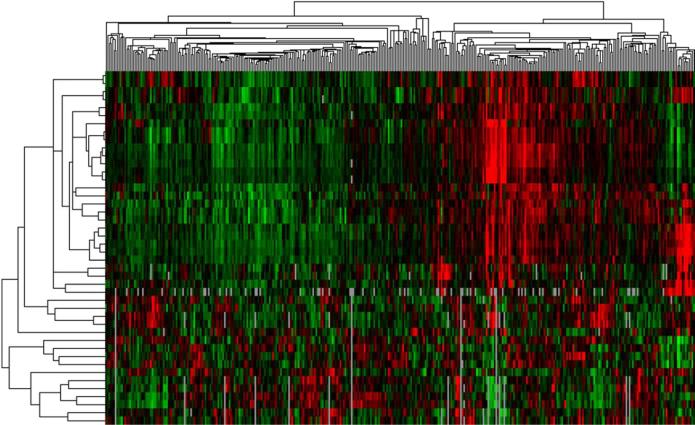
Figure 7. Sample Phenotypic Heat Map (“Pheno-Map”) Developed from Hierarchical Cluster Analysis of Quantitative Echocardiographic Data.
Caption: The rows in the heat map correspond to the various quantitative echocardiographic phenotypes (e.g., septal wall thickness, ejection fraction, early diastolic [e’] tissue velocity, etc.), while the columns represent individual patients. Red = increased values; green = decreased values. The dendrogram across the top of the heat map is a tree diagram that demonstrates the clustering of patients; the dendrogram on the left side of the heat map illustrates clustering of phenotypes.

