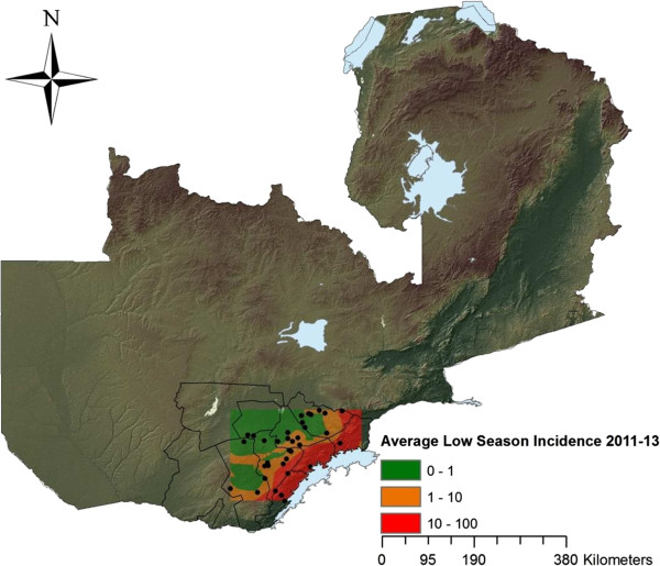
Figure 1.

Map of Zambia. Showing district boundaries of Southern Province. The borders of the colour pattern in Southern Province represent the study area, with the dots representing each of the 38 health centres involved in the study. The coloured incidence map further represent the averages of weekly incidence during 2011-2013 for the dry, low season (weeks 19-48) created by using Kriging. Lake Kariba is seen east of the study area.
