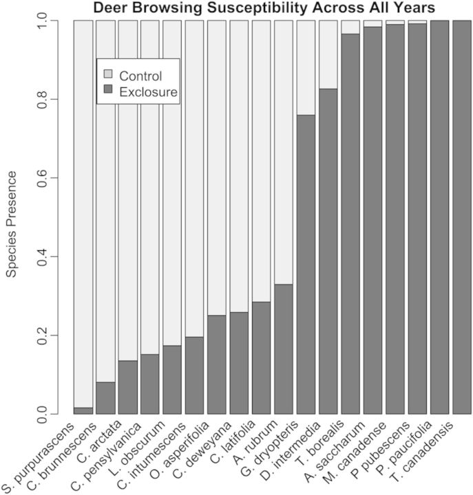
Figure 4.
A stacked bar graph representing the mean calculated DBSI of each species present in more than one exclosure in two or more years. Light grey bars indicate the proportion of the species present in control areas, while dark grey bars indicate the proportion of the species present in exclosures. Species are ordered left to right from the least susceptible (S. purpurascens) to most susceptible (T. canadensis).

