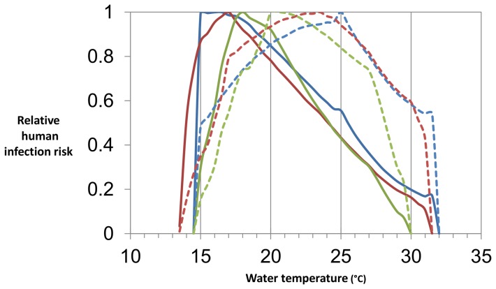
Figure 2. Relative human infection risk.
The blues lines show risk with no diurnal variation in temperature, the red lines with ±2°C variation, and the greens lines with ±5°C variation. The solid lines show the results of the lake scenarios and the dashed lines the results of the river scenario. All risks are relative to maximum risk for the same scenario.

