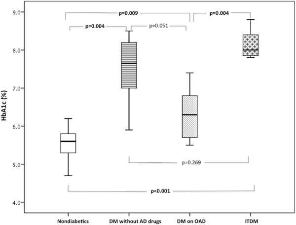
Figure 4.

Glycosylated hemoglobin levels according to chronic antidiabetic treatment. Box plots represent the interquartile range of values, the horizontal lines show the median, and whiskers represent the maximum and minimum values. In order to find between which antiadiabetic treatment categories there were significant differences, we compared two by two groups using the Mann Whitney U test.
