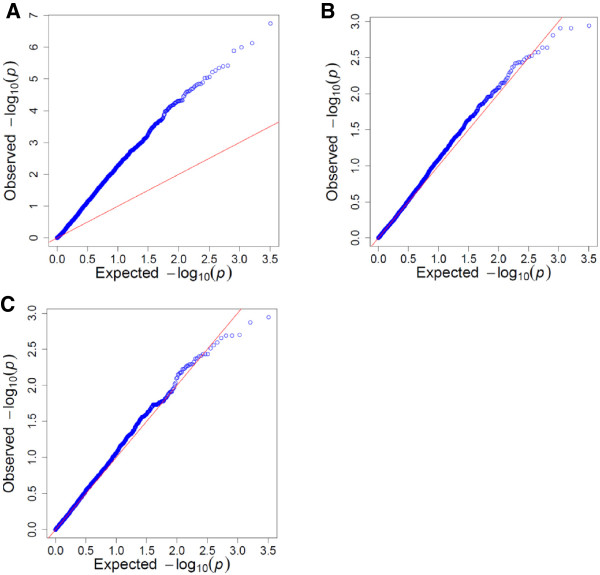
Figure 2.

Regression of the expected –log 10 (p value) on the observed –log 10 (p value). A Q-Q plot was used to compare the distribution of observed associations (blue dots) with statistics expected under the null hypothesis of no associations (represented by the red line) for the three linear models: a General Linear model (A), K Compressed Mixed Linear model (B) and a KP Compressed Mixed Linear model (C). The negative log10(p) was used instead of the p value so that the most significant markers are located at the top right corner of the graphs. A distribution close to the null hypothesis for most of the markers indicated a good control for false positives since it is expected that only a small number of tested markers are truly associated with the resistance.
