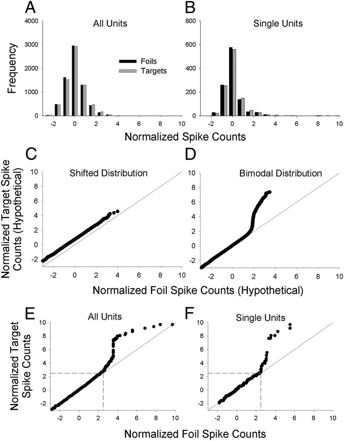
Fig. 4.
Distributional analyses of normalized spike counts. (A) Frequency distribution of normalized spike counts for each of 7,040 normalized target spike counts (32 targets × 220 units; gray bars) and 7,040 normalized foil spike counts (32 foils × 220 units; black bars). The means of the target and foil distributions are necessarily the same as the means of the target and foil means shown in Fig 2C ( and , respectively). (B) Single-unit frequency distribution of normalized target spike counts for each of 1,088 normalized spike counts (32 targets × 34 single units; gray bars) and 1,088 normalized foil spike counts (32 foils × 34 single units; black bars). Again, the means of the target and foil distributions are necessarily the same as the means of the target and foil means shown in Fig. 2D ( and , respectively). (C) Hypothetical Q–Q plot illustrating the expected pattern of results for a shifted distribution. The plot is based on simulated data drawn from one Gaussian distribution with an arbitrary mean of 0.75 and SD of 1 (target distribution) vs. another Gaussian distribution with a mean of 0 and SD of 1 (foil distribution). (D) Hypothetical Q–Q plot illustrating a bimodal distribution. The plot is based on simulated data drawn from a bimodal mixture distribution with a mean of 0 and SD of 1 for 95% of the scores and a mean of 5 and a SD of 1 for 5% of the scores (target distribution) vs. a unimodal Gaussian distribution with a mean of 0 and SD of 1 (foil distribution). (E and F) Empirical Q–Q plots for the frequency distributions shown in A and B, respectively. The Q–Q plots suggest a bimodal distribution of target (but not foil) values. In the Q–Q plot for all units (E), there are 112 target values (1.6% of the total) that account for the upward trending portion of the curve that begins at ∼2.5 on the x and y axes (boundaries that are indicated by dashed gray lines). Although it is not obvious, the remaining 6,960 scores (with x and y values below 2.5) fall close to the diagonal line of equality. For the single-unit Q–Q plot (F), there are ∼30 target values (2.8% of the total) that account for the upward trending portion of the curve that begins at ∼2.5 on the x and y axes (indicated by dashed gray lines). The remaining 1,048 values with x and y values below 2.5 fall close to the diagonal line of equality.

