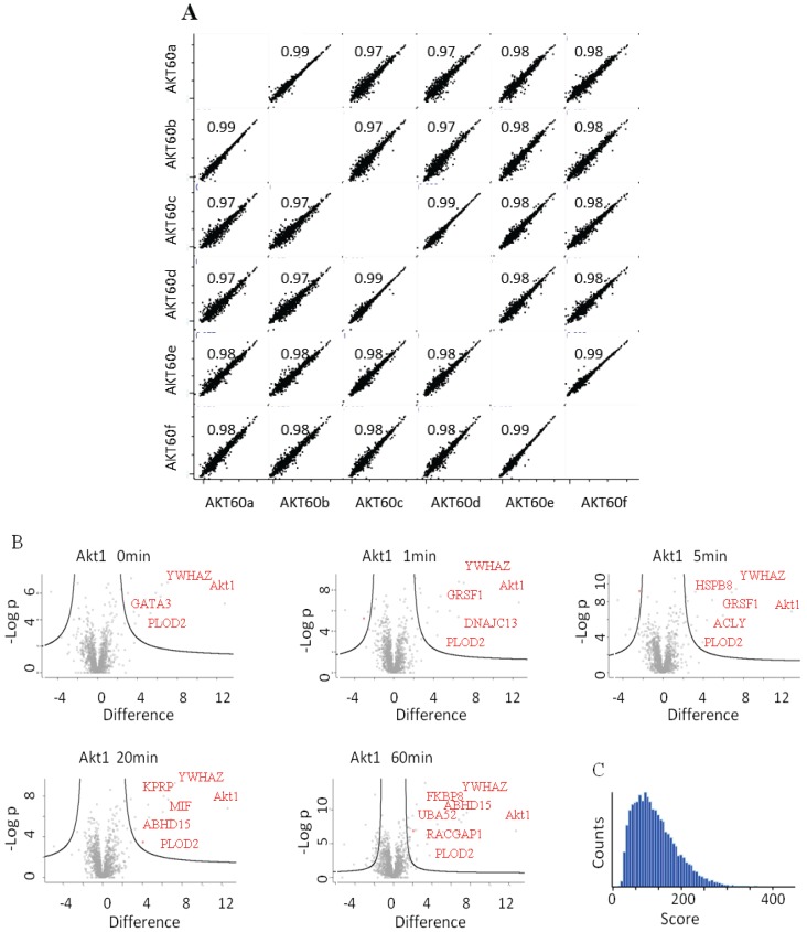
Figure 4.
(A) LFQ-intensity correlation of the replicates for the Akt1 60' samples, the diagram shows the high correlation not only among the technical but also for the biological replicates. Light blue numbers represent the Pearson’s correlation values for each dot-plot (B) Plot of the −Log p-value vs. the log2 intensity difference of the Akt1 IPs vs. the negative control. The potential specific interactors are present in the top right part of the graph. (C) Peptides Andromeda-score distribution for the Akt1 time course.

