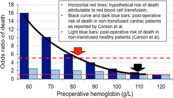
Figure 2.

Cost-benefit analysis of red blood cell (RBC) transfusion. The background histogram is drawn from data published by Carson et al. [13] (with permission) illustrating the relationship between pre-operative anemia and surgical mortality in 1,958 Jehovah’s Witness patients. Dark blue bars: preoperative hemoglobin (Hb) versus odds ratio (OR) of death in cardiac patients (risk of death increases as Hb level falls). Light blue bars: pre-Hb versus OR of death in patients who were healthy before surgery. We draw on this histogram: (1) dotted horizontal red line: no risk of mortality attributable to RBC transfusion (OR = 1); (2) hatched horizontal red line: hypothetical higher risk of mortality attributable to RBC transfusion (OR = 5); (3) plain curved black line: pre-operative Hb versus odds ratio (OR) of death in cardiac patients. A RBC transfusion is probably more useful than harmful when Hb level is below the intersection between the black curve describing the risk of mortality associated with anemia and the red line describing the risk of mortality attributable to RBC transfusion. If RBC transfusions are perfectly safe (OR = 1), the dotted horizontal red line and the black curve cross together at a Hb level of about 110 g/L (black arrow). If the risk of mortality attributable to RBC transfusion is high (for example, OR = 5), the hatched horizontal red line and the black curve cross together at a Hb level of about 80 g/L (red arrow). Where the true curve lies for cardiac patients is unknown. The curved line would probably move to the right in severely ill cardiac patients, and to the left if cardiac dysfunction is milder. The actual risk of death attributable to RBC transfusions in different cardiac populations remains to be determined.
