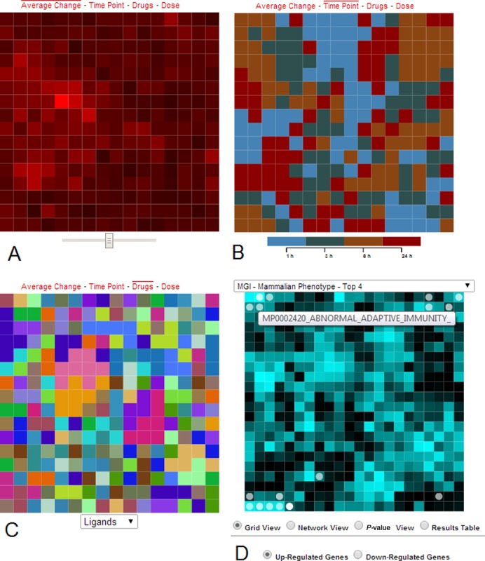
Figure 3.

Four views of the clustered experimental data. (A) Tiles represent individual conditions and are colored by their average change where bright red indicates more change. A slider below the canvas controls contrast. (B) The time point view colors the canvas by time points. (C) The drug view colors tiles by drug or ligand types, and a dropdown menu beneath the canvas allows users to highlight tiles of the same drug or ligand perturbations. (D) Gene-set enrichment analysis results, applied to the differentially expressed genes of the clicked tile, are displayed on the MGI-MP gene-set library enrichment canvas. Each tile on this canvas represents a gene-set, and circles highlight the enriched terms. Bright tiles represent high similarity among gene sets in the local region of the bright tile. A list box on top of the canvas allows user to switch between 30 different gene set libraries. The canvases fold on themselves such that the edges are connected to opposite edges forming a torus.
