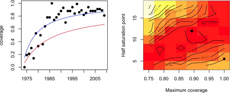
Figure 4.
Fitted curve (blue line, y=x/(5.53+x)) to reported vaccination coverage levels (black points) and curve reflecting the closest match between 15 simulated age-incidence profiles and the observed age incidence (red line, y=0.89x /(12+x)); the log sum of squares surface is shown on the right; parameters corresponding to the observed (square) and predicted (circle) shown. We assume that reporting rates increase gradually from 0.02 in 1980, reaching close to perfect reporting in 2008.

