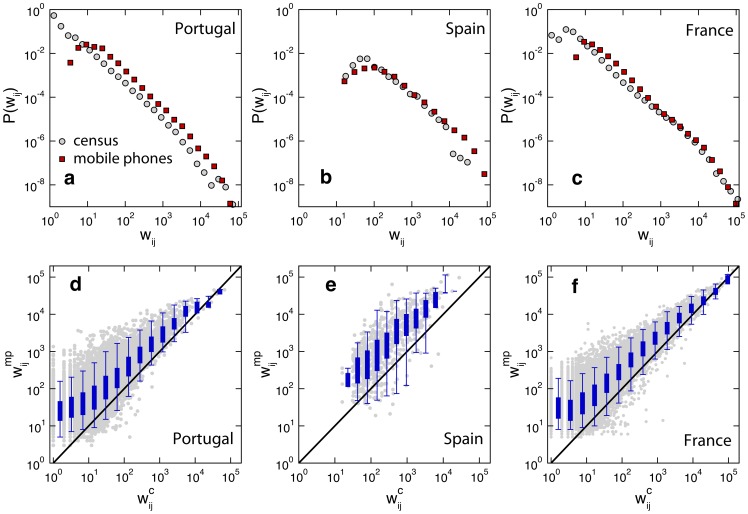
Figure 2. Comparing the weights of the census networks and the mobile phone networks.
Top: probability density distributions of the weights ( ) of the census commuting network (grey) and the mobile phone commuting network (red) in Portugal (a), Spain (b) and France (c). Bottom: comparing weights in the mobile phone network (
 ) and weights in the census networks (
 ) in Portugal (d), Spain (e) and France (f). Grey points are scatter plot for each connection. Box plots indicate the 95% reference range of values within a bin.

