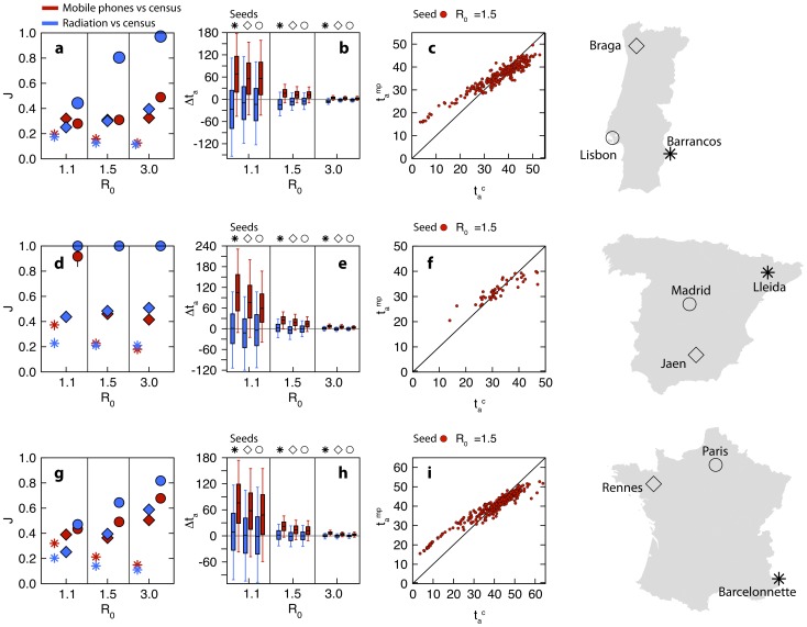
Figure 4. Epidemic spreading.
Comparing the epidemic behavior on the census network and two proxy networks, mobile phone (red symbols) and radiation model (blue symbols), in Portugal (top panels), Spain (middle) and France (bottom). a, d, g Jaccard similarity index measured between the epidemic infection tree of the census network and the infection tree of the proxy network, for three values of the basic reproduction number  . Each symbol corresponds to a different initial infection seed, displayed on the map (right panels). b, e, h Differences between the arrival times in the census network and in the proxy network, for different values of
  and infection seed. Box plots indicate the 90% reference range, measured on all the network nodes. c, f, i Comparing the arrival times in the mobile phone network
  with those in the census network
  , for
, for  and the epidemic starting from the capital city. Red points are scatter plot for each node of the network and we subtracted the average systematic difference
  from each
  .
.

