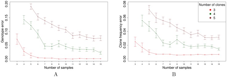
Figure 2. Simulation results.
The figure plots the mean (A) genotype error  and (B) clone frequency error
  as a function of the number of subsections. Each mean is computed over 100 simulated data sets. For each data set, the EM optimization is repeated from 10 different random initializations, and the results corresponding to the largest log likelihood are reported.

