
Figure 3.
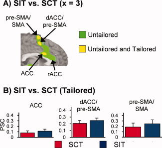
Panel A is a binary bichromatic map depicting regions that exhibited statistically greater activation for SIT compared to SCT trials in the untailored model (green coloring) or both the untailored and tailored model (yellow coloring). Panel B presents mean percent signal change (PSC) values for the SCT (red bar), and SIT (blue bar) conditions for the three dMFC clusters from the tailored model (error bars = 2 × standard error of the mean). Location of slice (×) is given according to the Talairach atlas.