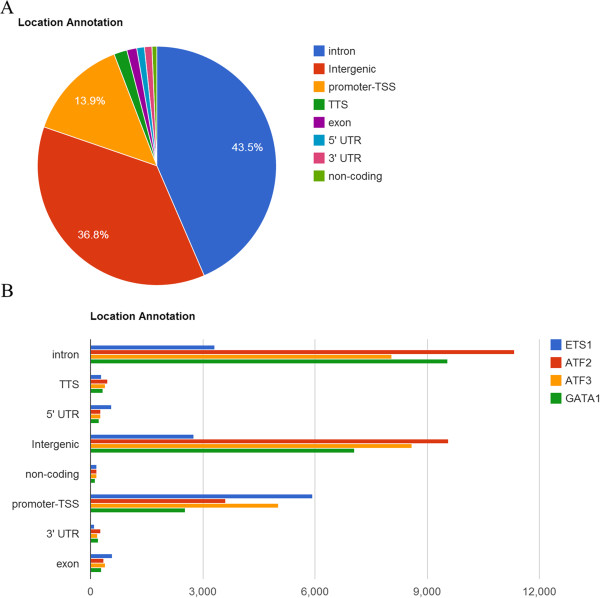
Figure 2.

Pie chart and bar chart of genomic location distribution. (A) Pie chart of the genomic location distribution of transcription factor ATF2. This plot shows the percentage for each genomic location category. The categories are sorted by descending percentage. The exact percentage for each category appears if the mouse pointer hovers over a pie slice. (B) Bar chart of the genomic location distribution of four transcription factors, ETS1, ATF2, ATF3 and GATA1. All uploaded files are combined into the same bar chart. This bar chart reveals the actual number of peaks for each category when the mouse pointer hovers over each bar.
