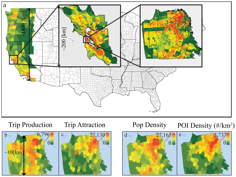
Figure 2. Trip production and attraction at different scales.
(a) A map showing the three selected regions of study representing: the Western U.S., the Bay area, and San Francisco. The color bar represents population density. (b–e) Commuting trip generation rate, trip attraction rate, the population density and the POI density in (#/km2) in San Francisco. While the population density has high correlation with the commuting trip generation rate, the POI density has high correlation with the commuting trip attraction rate. In contrast, at the scale of the Western U.S., the population density correlates with both the trip generation rate and the attraction rate, as shown in Table 2. The maps are generated from ARCGIS using TIGER/Line Shapefiles.

