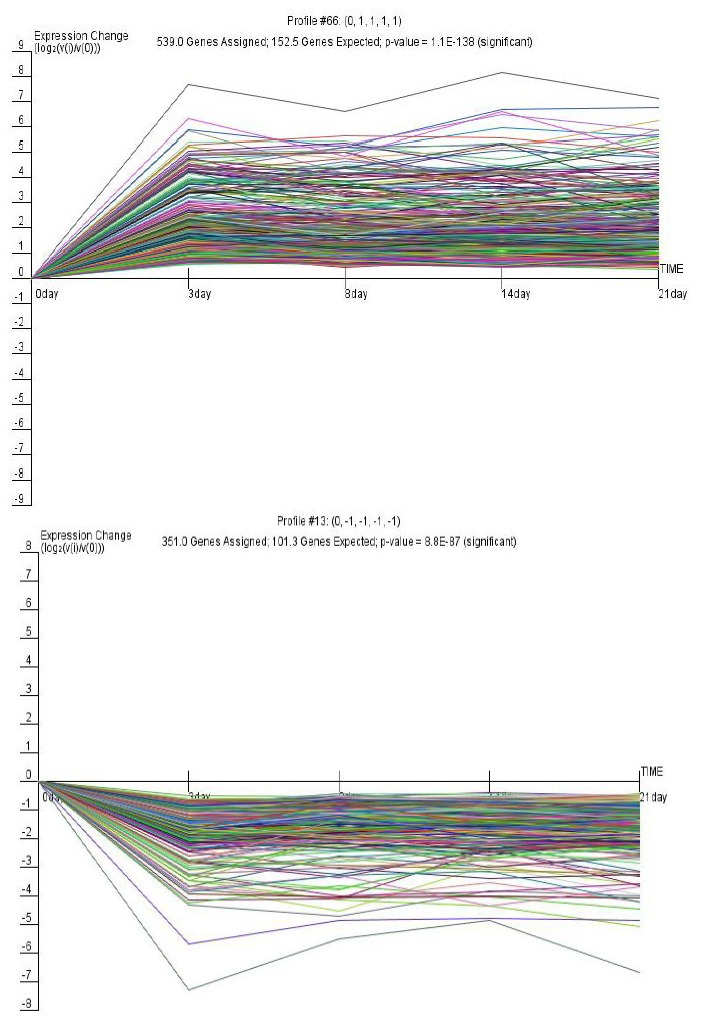
Figure 2.

Gene clusters of significant expression profiles 66 and 13. The horizontal axis represents time, and the vertical axis shows the time series of the level of gene expression after log normal transformation. Each diagram contains the model profile ID at the top center. “Genes assigned” represents the number of genes actually assigned to the profile; “Genes expected” represents the expected number of genes based on a permutation test of time points; p-value represents the significance of the number of genes assigned versus expected.
