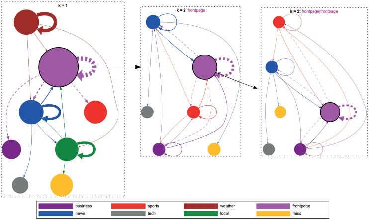
Figure 11. Local structure of navigation for the MSNBC dataset.
The graphs above illustrate selected state transitions from the MSNBC dataset for different  values. The nodes represent categories and the links illustrate transitions between categories. The link weight corresponds to the transition probability from the source to the target node determined by MLE. The node size represents the global importance of a node in the whole dataset and corresponds to the sum of the outgoing transition probabilities from that node to all other nodes. For visualization reasons we primarily focus on the top four categories with the highest sum of outgoing transition probabilities – i.e., those with the largest node sizes – for an order of
  . For those nodes we draw the four highest outgoing transition probabilities to other nodes. In the middle figure we visualize the Markov chain of order
  by setting the top topic (frontpage) from order
  as the first click; this diagram shows transition probabilities from top four categories given that users first visited the frontpage topic (represented by the dashed transitions in the left figure representing
  ). For example, the links from the blue node (news) in the top-left corner of the diagram represent the transition probabilities from the sequence (frontpage, news) to other nodes. Similarly, we visualize order
  in the right figure by selecting a node with the highest sum of outgoing transition probabilities (frontpage, frontpage) and its four highest outgoing transition probabilities from order
  (represented by the dashed transitions in the middle figure representing
  ). We then show transition probabilities from other nodes given that users already visited (frontpage, frontpage). For example, the links from the red node (sports) at the top represent the transition probabilities from the sequence (frontpage, frontpage, sports) to other nodes.

