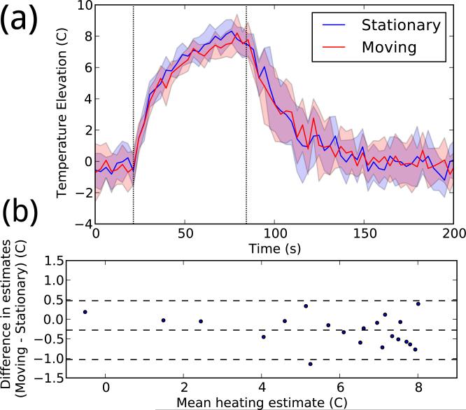
Figure 7.
(a) Temperature data reconstructed with and without motion. In each color, the central line shows the mean peak temperature timeline for eight experiments, and the shaded area shows one standard deviation above and below. (b) Bland–Altman plot comparing the two sets of temperature measurements. Each point represents a single time during heating (from 21–81 seconds), averaged over all repetitions.

