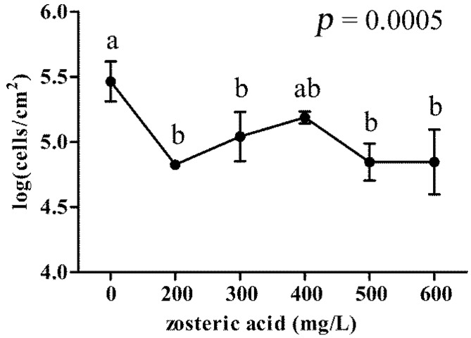
Figure 3.
P. putida cells adhesion in presence of different concentrations of zosteric acid. In the graph, vertical axis shows log(CFU/cm2) values and horizon axis represents different tested concentrations. Each value corresponds to the mean of four replicates. The graph provides the p-value obtained by ANOVA analysis. According to post hoc analysis (Tukey–Kramer, p < 0.05), means sharing the same letter are not significantly different from each other. Bar errors show standard deviations.

