Fig. 2.

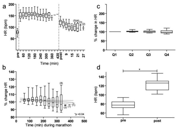
Changes in HR (bpm) before, during, and after the marathon. Box and whisker plots represent range, median, and interquartiles. a) HR before, during, and after the marathon is plotted continuously. Before and after the marathon, each plot represents the average HR over 3 minutes. During the marathon, each plot represents the average HR over 30 minutes. Small numbers in parentheses denote the number of subjects included if the sample size ≤ 5. b) The change in HR over time during the marathon in 30-minute non-overlapping intervals relative to the first 30 minutes of the marathon (first horizontal dash). The solid line indicates the best fit regression line and the dotted lines represent the 95% confidence interval. Small numbers in parentheses denote the number of subjects included in each average if the sample size was ≤ 8. c) The change in HR during each proportion of the marathon relative to the first proportion of the marathon (first horizontal dash.) d) HR pre- versus post-marathon.
