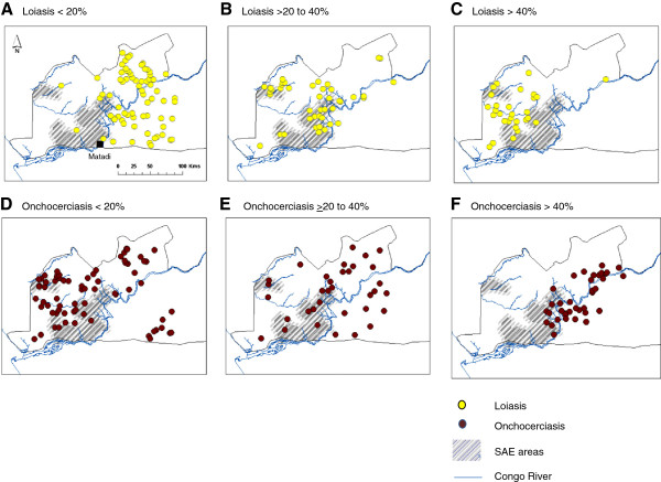
Figure 1.

Geographical patterns of loiasis and onchocerciasis prevalence levels in relation to health districts reporting SAEs. Grey shading indicates SAE areas. Yellow dots indicate loiasis prevalence A. <20% B. 20 to 40% C. >40%. Brown dots indicate onchocerciasis prevalence D. <20% E. 20 to 40% F. >40%.
