
Figure 2.
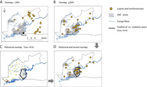
Geographical patterns of overlapping high and low loiasis and onchocerciasis prevalence levels in relation to historical co-endemicity and health districts reporting severe adverse reactions. Grey shading indicates SAE areas. Yellow dots with brown perimeter indicate overlapping loiasis and onchocerciasis prevalence A. <20% B. >20%. Historical prevalence and co-endemic zones are outlined in C, and the geographical relationship between historical co-endemic zones, overlapping prevalences of >20% and SAE areas highlighted in D.