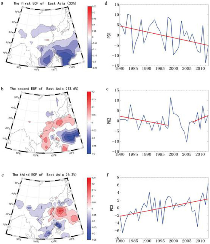
Figure 2. The first three EOFs (left panel, (a), (b), (c)) and principal components (right panel, (d), (e), (f)) for annual precipitation of study areas during 1979–2012, and the red line in the figure indicates the linear fitting of the principal components.
The maps in the figure were created by D.Y. using Matlab 2011b.

