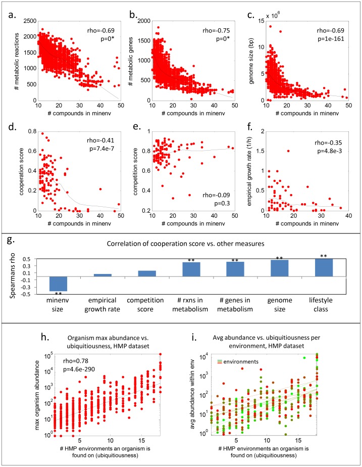
Figure 4. Nutritional fastidiousness scales with various ecological and lifestyle factors.
The plots compare minenv size to (A) the number of metabolic reactions, (B) the number of metabolic genes, (C) the size of the genome, (D) cooperation score, (E) competition score, and (F) growth rate for all organisms we were able to map. Cooperation and competition scores were computed as averages per organism of all organism-organism scores from [7], and empirical growth rates were taken from [38]. A higher cooperation(competition) score denotes more cooperation(competition). Lines in each plot denote robust Lowess fits. (G) shows the Spearman rhos for the cooperation score against various other measures; ** denotes significance with p<1e-4. Notably, cooperation score correlates better with lifestyle class than the other metrics tested. (H) shows organism max abundance of each organism (y-axis) versus the count of environments in which the organism was present (i.e., ubiquitiousness; x-axis) in the Human Microbiome Project (HMP) dataset (from the OTU abundance table in the 2010 HMP data freeze). Dots represent individual OTUs. (I) depicts average abundances of all organisms with a given ubiquitiousness score in a given environment (dots), with a different color and a trendline for each environment. All lines in (H) and (I) are exponential fits.

